Monday, 5 December 2011

Evaluation: How effective is the combination of your main product and ancillary texts?

The poster is used to draw people into the film, to make them want to look further into it to see if they might want to watch the movie, the magazine gives further background knowledge of the movie as it claims the magazine has interviewed stars from the movie inside it would contain info which may persuade people to watch the film and the trailer also persuades people to watch the film and shows them some of what would be included in the film. They work together in one draws in audience and the others persuade.

The film genre I chose was 'Horror' the genre is suggested in all 3 products. The genre is portrayed in the trailer through the use of music, lighting, location and what the people in the trailer are doing. The genre is portrayed in the poster through the editing, colour scheme and tag line, and the genre is portrayed in the magazine through the dark clothing worn by the models and the colour scheme.

The same audience is targeted in all 3 of my products, children wouldn't read the type of magazine I have created, they would be scared of the poster/ unattracted to it and the trailer is for 15+ people.

I have created a theme between them all by using the same Grey, black and red colour scheme in all my products. This is a good thing to do so you can tell all the products link together and if someone sees the poster they could easily find the trailer and tell that it is from the same film as the poster was etc.

I think overall they worked together effectively.

Evaluation: What have you learnt from the audience feedback?

Trailer
Initially when doing my trailer I went out, filmed some material and thought that would be the only things I needed to film during the whole project. I constructed my first trailer which I thought would be ok however after audience feedback I realised a lot needed to change. I was told I needed a bigger variety of shot types, shorter length and more clips, to make audio louder and to introduce the characters. I had alot to do which slowed down the production process of my trailer. I had to go back to my location and film even more material so I had to get thinking on what would be good to add, plus I had to create a whole new storyboard and running order. When getting the feedback for the first trailer I wasn't entirely sure what was meant by 'introduce the characters' so I filmed them saying their names to the audience and placed it at the beginning, after watching the trailer back I realised that this was a bad thing to do. I added the new material and got more feedback, I was told that this isnt what was meant by 'introduce the characters' and was told how I could have done it better, I was told that my trailer didn't look professional as it didn't have a 'green screen' like most existing trailers or a company logo at the beginning so I realised I had to add these into the 3rd version of the trailer. I was told that it doesn't build up suspense like trailers that already exist so I went and looked at some more teaser trailers and noticed that in horror trailers they start with longer clips towards the beginning of the trailer and towards the end they have shorter fast paced clips to help build up suspense so I did this in my own trailer along with adding a new sound effect which was a banging sound. The audience feedback played a huge part in me producing a better quality trailer and sticking to the movie genre.

Poster
When doing my audience research most of them told me that trailers attract them into watching a film the most so I realised I had to spend more time on perfecting my trailer. I made my poster with inspiration from an existing horror movie poster so I thought it would fit audience needs. I got audience feedback once I created it and they said it was good and fitted with the horror genre however it needed the small font credits and stuff at the bottom of the poster. At first I didn't put it on the poster because I thought it would ruin it and one poster I looked at didn't have it on and it still managed to look ok however audience told me it would look more professional so I added it to my poster. It did help to make my poster look of better quality.

Magazine


This is the first version of my magazine cover, after getting audience feedback I was told that the picture needed to be bigger and the title of the main film needs to be placed somewhere different as it wasn't too clear that it was linked to the picture. I then decided to make the amendments according to the audience feedback along with some of my own changes.


This is the 2nd, edited version of my magazine cover. I think the quality looks better and more professional than the first one. Getting continuous audience feedback for my products was a good idea as it helped them to increasingly get better and meet audience expectations.

Saturday, 3 December 2011

Evaluation: In what ways does your media product use, develop, or challenge forms and conventions of real media products?

I created 3 media products, these were a trailer, a poster and a magazine front cover. They use some conventions existing media products use but also challenge the conventions, I also developed some conventions so they met audience needs more.

Trailer
When doing my research on horror movie trailers I noted down certain conventions which I noticed appeared in basically all of them. These were:

  • Dark Lighting
  • Ghostly Music/ Suspense building music 
  • Not perfect camera work (tilted, fast moving, shaking)
  • Longer clips at the beginning then shorter ones at the end
  • Screams
  • Abandoned location/ haunted house
When filming my clips I found it hard to ensure that the lighting was dark due to the fact I didn't have access to artificial light sources where I was I had to work with the natural lighting and go out to film when it was still light outside. So to make my trailer look darker I had to edit the clips and decrease the brightness, I did this in windows movie maker. 

Here is a shot from the trailer, originally the clip was very light so I decreased the brightness, I think it looks more effective like this as it is like shes running into darkness. Makes it fit in with the horror genre more.


The location was meant to be mysterious. The girls had heard stories about what does on in the block but nobody really knew the truth. I had to portray the setting which was described as 'Hell' in my trailer to look fearful due to the fact it was the setting of a horror movie, I had to stick to the genre at all times. I decided to explore with the camera techniques and do something which I didn't see in any existing trailers, all the trailers I watched contained footage all in focus, so I thought id go for a new technique and have some out of focus and see what the audience think. I started off with a close up of a bit of the block, the close up was in focus, from seeing this the audience wouldn't really be able to tell much about the location. The camera then slowly zooms out revealing more of the building, when the camera zooms out it does out of focus which I thought made the building seem more mysterious and help to build up the tension and atmosphere surrounding the location.

The location in itself was a convention of the movie genre I chose to portray, it is a cliche scenario, 3 females going to an abandoned, apparently haunted tower block will usually indicate something bad would happen. The location and plot is similar to that of 'Halloween Resurrection'  so I decided to use this theme of an abandoned settlement and develop it. 

I went on freesound.org to get my music and sound effects, it took me a while to find what I was looking for but the sounds were effective and helped to build the effect I was looking for. Originally my trailer had a scream sound effect at the end but I removed it as I thought the scream sounded a bit too fake and sort of killed the emotions that were built up. When doing trailer research I looked at a trailer of the film 'Orphan' and noticed that at one part of it a short (1 second max) clip would come up, then go black, then another short clip would pop up again etc. I felt that this was an effective technique as when the black parts came up it left you wondering what was going to happen, building up tension. I decided to adopt this idea in my own work but decided to have a banging sound effect to play whenever the clips popped up to create a certain mood and to potentially frighten audience. I got the bang sound effect from freesound also.

The majority of trailers I watched all had the green screen at the beginning and some sort of company logo. At first I didn't put them in but I then after audience feedback they said it didn't look very professional so I decided to add them to my trailer, it did look alot better afterwards.

This is one of the titles from my trailer, the background is black and the font is red. I chose to use these colours as black and red are commonly related to 'Horror' black represents death and red represents blood and murder so I believed these dark colours would be better than yellow and pink for example which are happy colours. The font I used was chiller, since I couldn't create a fancy background and effects I decided to use a 'horror' type font, the most appropriate and readable one I could find was chiller, it sort of looks like it was written in blood which is why I chose it. Below is a title from 'The Messengers' trailer, if I had access to better software I would have tried to create something like this, I like the way the background is sort of decaying and then there is a basic font. For my title I had to do the opposite of this.


Poster

Here is my final movie poster, when doing my research on posters I noticed that most had a section at the bottom of the poster containing producers, actors and directors of the film, at first I thought i'd challenge this convention and not include it in my own poster but then audience said it needed it to look more professional, after I added it I did realise it looked alot better.

Most of my ideas came from this movie poster here, this poster is quite unique, I didn't see another one like this. Like this poster I placed my skyline/ tag line at the top of the poster, the subject (in my case a picture of a girl) in the middle, and the credits and movie title at the bottom. The thing that is different about this poster is that they have put special effects on it to make it look old and decayed. I decided to try and use this idea in my own poster. Also the eye on this poster has been edited so it doesn't look normal and I have done the same to my own poster. I think the editing of the image fits in with the horror genre well as it looks scary. On my poster I also used a horror type font which I got from dafont.com it looks like blood dripping.

Magazine
When looking at existing film magazines I noticed that many of them had the model on the cover, which was a character from the main film the magazine was discussing, had a part of the models body covering part of the mast head so I decided to use this technique in my own magazine to make it look like more effort has been put into it and it would look more technical. My magazine has 2 models on the front cover advertising the film 'escape' however I didn't see any other magazines using 2 characters as the main image. Alot of the magazines placed their model in the middle but as I had 2 models I decided to place them on the left hand side of the cover to allow more writing space and so everything could be in a neat order. I used basic fonts like all the other covers and stuck to a particular colour scheme of 3 colours, anything more would have looked messy and unprofessional. 


Thursday, 1 December 2011

Evaluation: How did you use new media technologies in the construction and research, planning and evaluation stages?

I used a variety of new media technologies in the planning, researching, production and evaluation stages of my project.


Research
For my research stages I used Internet (mainly google) to look for magazine covers, film posters and to get information on my chosen genre, I used microsoft word to create a questionnaire for my audience research and I used microsoft excel to create graphs displaying the results for the questionnaire.

Microsoft Excel
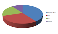


I used excel to create graphs displaying the results of my questionnaire. Excel was good to use as there was a variety of different types of graphs to choose from, I picked graphs which were most suitable for the type of results I was displaying, if I wanted the figures to be known by the people looking at the graphs i'd use a bar chart as it places values at the side, and if I didn't mind then i'd use a pie chart which gives a visual representation on which results were more common than others. One bad point with using excel is that I used the most recent version of it at college whereas at home I have the 2003 version, on the new version I didn't know how to add a title to the graph so instead I had to write a caption by it to indicate which question the results were from which was a bit annoying.


Internet

I used the internet during the research stage to find movie posters, movie magazines, teaser trailers and to research my genre to find out the main conventions. I also used to internet to listen to copyright music and sound effects to find some for my own trailer. When using the internet to research I had to be careful about the sites I was using as sources of information as sometimes it cannot be reliable, for example Wikipedia is not a very reliable source for information so when researching I had to be careful and ensure I didn't use this site as well as other potentially unreliable ones. Another problem I come across is that when I was doing my research is that when I was trying to find a list of horror movie conventions I couldn't find one on the whole internet so I had to formulate a list myself based on what I had seen in teaser trailers and horror films i've watched before. A good point in using the internet is that it is more or less always quite fast and everything you need is in one place.


Word


I used microsoft word to create my questionnaire which I handed out to 10 people. Microsoft word was ok to use however I did face a limitation in my design.


Planning
For my planning stages I used microsoft word to create my storyboard and other things and I used a digital camera.

Digital Camera


I used my camera in the planning/ post production stage to take pictures for my magazine cover and for my poster. I also visited the locations which I had in mind for filming my trailer and took pictures of them in order to write about them. This camera was good to use as it had a powerful flash and when I was taking the images I was in a dark location.


Microsoft Word


I used microsoft word to create the template for my story board word was good to use as it was easy to draw the table as there was a drop down menu where I could choose how many columns and rows I wanted my table to have which saved time, it was also easy to resize the columns and add more rows.


Production
For the production stage of my work I used a lot of different softwares, I used Photoshop, Paintshop Pro, Windows Movie Maker, Paint and a Digital camera all to create my media products (trailer, magazine cover and poster).

Photoshop and Paintshop Pro


I used photoshop to create the magazine front cover. Photoshop was good to use as it is flexible and has a wide range of colours to use and fonts, also when resizing a photo on photoshop it doesn't cause it to go pixelated. Photoshop would sometimes stop responding so I’d lose everything that I done. So I made sure after that I saved after every little thing I done to avoid having to start all over again. I used paintshop pro to do my movie poster, I have paintshop pro at home so I use it regularly and found it easier to use than photoshop which is probably the reason why my poster is better than my magazine cover. I think that I should        have used 'In Design' to create my magazine front cover so that it would have looked more professional. I think paintshop pro was a good choice for my poster as it allowed me to edit it accordingly to fit the genre.


Editing done on paintshop pro which wouldn't have been achievable using 'in design'


Windows Movie Maker


I used windows movie maker to make my teaser trailer. Originally I wanted to use 'Adobe Premier Pro' but when I imported my video clips to it they wouldn't play it would just be black so I had to use Movie Maker. Using movie maker meant that I was limited with what I could do. It would often freeze and make me have to restart my laptop but luckily it automatically saved my trailer so I could recover it after. I believe my trailer could have been better if I used premier pro however movie maker was ok as it did allow me to edit brightness, contrast etc of the clips and had lots of different transitions I could use.


Paint


I used paint to save the print screens I look of the editing process and more. Paint is easy to use and it was easy to crop out anything I didn't want to be in there and to resize it. I also had a choice of which file type I wanted to save the image as.


Digital Camera
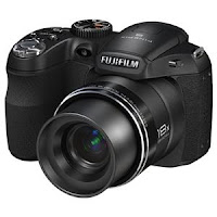


I used my digital camera in the process to film new clips to add to my trailer during the production process. This camera I used was good as the zoom is good and the quality of the video is good.


Evaluation
When answering my evaluation questions I didn't use too much technologies I used the internet to retrieve pictures of software logos and I used blogger


Blogger


I used blogger throughout my whole project, any work I did was uploaded onto blogger. The bad thing about blogger is that sometimes it would be hard to place a picture where you wanted to place it, and you couldn't size an image to the exact size you wanted it you had to chose from small, medium, large, x-large and original which would be a pain.
The good thing is that all the work is there in one place.


Saturday, 26 November 2011

Feedback For Trailer 2 and 3

Trailer 2 Verbal Feedback Main Points


  • Needs Green screen
  • Needs company logo at beginning
  • Dialogue hard to hear
  • Needs shorter clips towards the end
  • Introduce characters in a different way
From these points I decided to mute dialogue and do a voice over, add green screen and company logo, change order of clips, make some clips shorter and place them at the end, film a new 'character into', redraft storyboard

Comparison of trailer 2 to trailer 3