Thursday, 13 October 2011

Magazine Cover Drafts


This is the first movie magazine cover I created, I like it however I feel the image needs to be a bit bigger and it needs to be clearer that the image relates to the 'escape' film. I also think that the cover could look alot tidier and more professional.


Wednesday, 12 October 2011

Movie Poster Drafts


This is how I want my poster to be layed out.Versions


This is the 1st version of my poster, after audience feedback I was told to add the information (actors, producers) under the title like other film posters do


Tuesday, 11 October 2011

Magazine Front Cover Images


We took a selection of images, when the right one is chosen I shall crop it and edit it. I am thinking I would like the magazine front cover to be a grey as black wouldnt work.

Movie Magazine Research


The background of this magazine is blue and the masthead has been created to fit in with the blue background and the concept of the background. The masthead is at the top of the magazine and is in capital letters in a basic font which stretches along the whole width of the magazine, the magazine is called 'total film' they have done something clever with the masthead and put the words 'FILM' stretched across and the word total is placed in the top section of the f which looks interesting and effective, it also saves space on the cover. Above the masthead is a skyline which says 'the mind-blowing issue' which not all of these magazines would say, so it signifies that it is some sort of special issue, the main film it is promoting is 'Inception' most people that would be drawn to the magazine would probably know what inception is about and would realise that the skyline relates to inception. The model on the cover is placed in the centre of the cover, his head covers some of the masthead. The model is wearing a black suit with a white shirt, the left side of this face and body has shadow on it which makes it look mysterious. All the information on the main film of the issue 'inception' is placed down the models stomach and leg area and the other information about what else is inside the magazine is placed on the left and right had sides which does make the cover look a bit hectic and unorganised. All the writing is white and red.


Film Poster Images


When doing my research on horror film posters I noticed that the majority of the images on the covers were close ups of a particular character from the movie generally looking scared or something so I decided to take this idea. I tried to put on a scared/shocked facial expression and I wanted there to be a mysterious black hand on my shoulder to show why the character is frightened and what sort of genre the film is. First of all I decided I wanted to have a black background but when taking the images it was hard to see the hand.. I later found out this was because I had the flash on. When walking round I found a rusty gate and tried to take the image through the bars to show some of the bars and make the character look trapped, however this failed. I then took images again not using the flash and they came out ok.. I am going to use one of the last 2 images.

Friday, 7 October 2011

Teaser Trailer Version 1

This is the first edit of my trailer, I think it is ok however there is much work to be done. To improve this I shall film more footage displaying different types of shots. I will also film each character individually and introduce them at the beginning to get a feel for the type of people in the movie. I will also show the 2 seperate buildings to make it more clear.

Friday, 23 September 2011

Film Poster Research


The main colours used in this poster are neutral colours and dark reds which represent the horror genre as they wouldnt use bright colours as horrors are usually at night time and have dark plots.
The poster contains a series of shots from the film which are arranged on the page to look like a scary face, which leads the audience to believe that the film being advertised is a horror film.
The small images we see from the film to create this face doesnt show us much about the film and covers the whole page, the only other things on the page are text, which is placed over the images.
The message on the poster is verbal as it says 'The most terrifying images are the ones that are real' this supports the reason for there to be various images on the page.
I think that the intended audience is adults or older teenagers as children are usually scared of horror movies or are not allowed to watch them. Children would also not be attracted to this poster, they are attracted to colourful things. The poster itself doesnt contain any persuasive language to try and get people to watch the movie however the poster itself and the tagline which says 'the most terrifying images are the ones that are real' could attract people to watch the movie, this poster is quite unique so it is persuasive in its own rights.
Some movie posters contain quotes from critics/ newspapers that have already viewed the film however this poster doesnt. I think the poster is very effective as it is unusual, it would make me want to look up the trailer to see if the film looked watchable if I saw the poster on the street I wouldnt walk past it.


Similarly to the previous poster this one also uses neutral tones and firery colours to represent the genre of the film. The main message of this poster is to display the title in physical form which is why under the woman and at the bottom of the poster there is fire, people believe hell is a place full of fire and is below ground and that heaven is above ground which is why they show the sky to be dark as heaven isnt an option for the character and she seems to be engolfed in the flames, the title of the film is 'Drag Me To Tell' which is why there are demonic, gruesome hands coming out of the fire (coming out of hell) and grabbing her clothes, jewellery to show she is being 'dragged'. Most of the messages are visual. The intended audience for this poster is old teenagers/ adults as children might be frightened of this sort of film and there are usually 15+ age restrictions on horror movies to prevent terror, also elderly people generally do not watch horrors. Again, on this poster there is no quotations from critics to recommend the movie. Attention is gained from the striking images on the poster and the bright fire which stands out from the rest of the dull coloured poster. I think the poster is ok however the information given on it and the picture on it doesn't really give us any more knowledge of the film than what the title gives us, not very persuasive however the image is eye catching.

·   


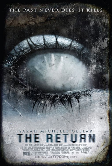
The main/ only colours used are greys, blacks and light blue. The tag line mentions dying and killing and often when people die they become very grey and pale so this could be why these cold colours are used. There arent really any symbols on this poster, there isnt much on the poster all we see is a close up of an eye which doesnt have a pupil or anything on it its just white-ish with a hand inside which looks like its pushing the eye, this looks very interesting but doesn't tell us much about the film or relate to the tag line, we are left wondering what relevance this has to the movie - if any, which may sway somebody to watch the film. The poster has also been heavily edited to give a decaying/ grunge look which i like, I might try to recreate this on my own poster. Unlike the other posters the messages on this one are mainly verbal, which is a risk because if people are not swayed to stop and read it then it is a problem, however the posters message is 'the past never dies, it kills' which tells us that the plot will be about a disturbance from the past coming back or something. Also at the bottom of the poster it says 'This november, fear comes home' so they are basically saying that the movie will frighten people. There is no critical reference on this poster to help sway people to watch the film. Overall, the poster is visually good but doesnt give alot of information. Not a very good all round poster.